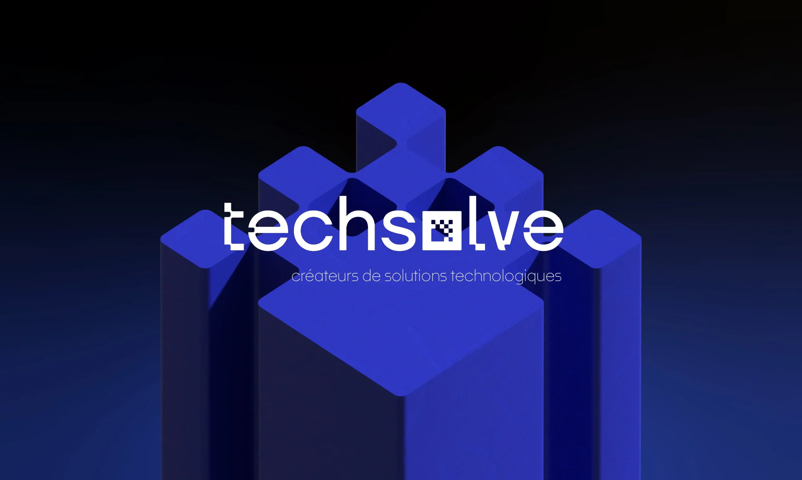
TECHSOLVE

A rebrand that merges analog and digital worlds, giving TechSolve the visual edge to outgrow its local market and connect with bigger opportunities.
Challenge
Objective
Elevate Techsolve’s brand aesthetics and communication to a level that commands attention, locally and beyond, while creating a consistent identity across all mediums.
Solution
Initially, the client believed a simple logo refresh would be enough. After discussing their ambitions, we proposed a broader approach: a unified visual system covering logo, social media, website, print materials, iconography, and future merchandise. This ensured the brand would look cohesive and professional in every context.
Design
One of Techsolve’s key services is transforming physical documents into digital databases. We built the design concept around this duality, where analog meets digital. A solid square symbolizes a sheet of paper, while smaller squares represent data bits. Together, they echo the structure of a QR code, a fitting metaphor for bridging the tangible and the digital worlds.


